The Great Sushi Race
Tech stack: Nextjs, MongoDB, Zustand, Pixi.js
 Source
 -
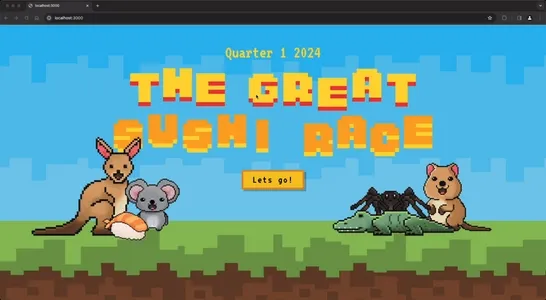
The weekly meetings at one of my previous companies relied on
traditional charts and spreadsheets to communicate quarterly revenue
performance across sectors, making it difficult for teams to quickly
grasp their progress relative to goals.
-
I designed an interactive dashboard that visualized sector performance
as a race between Australian animals, where each animal's position
represented how close that sector was to hitting quarterly targets. This
transformed dry financial reporting into an engaging visual that made
performance gaps immediately apparent to leadership and motivated teams
through friendly competition.
Technical highlights: Large-scale React architecture, real-time data
visualization with Pixi.js, optimized state management for smooth
animations.
Statistical Pairwise Comparison Ranker
Tech stack: Built using: Vue, Nuxt, PostgresSQL, Vercel,
Live Deployment Source -
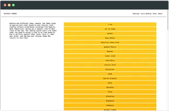
Most ranking systems break down when comparing fundamentally different
categories—how do you fairly rank Batman against a Toyota Corolla? I
built an application that uses ELO rating algorithms to handle these
"apples to oranges" comparisons, revealing unexpected patterns in human
preference hierarchies.
-
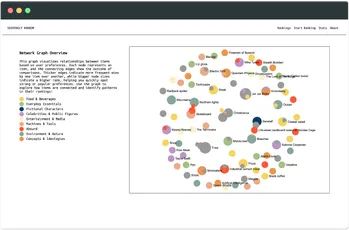
The system generates a dynamic network graph showing relationship
clusters between unlikely items (Nicolas Cage cardboard cutouts vs. wet
socks vs. the Ghostbusters film), creating a visual map of how people
actually make irrational comparison decisions. This exploration into
comparative psychology demonstrates how statistical models can extract
meaningful insights from seemingly nonsensical data.
Technical highlights: ELO rating implementation, dynamic graph
visualization, statistical analysis of irrational decision patterns.